From WhatsApp to Web: Transforming a Smokehouse’s Ordering Experience
Project Summary
Smoked Meeting Express is a local catering business seeking to improve its existing ordering system. This growing business wants to stop using Instagram DMs and Whatsapp as their point of sale and offer customers a secure experience. Our client wants to create a website with an online ordering feature highlighting their offerings of smoked meat.
My teammates and I designed an online ordering experience prioritizing visual cues while guiding users through the customization offered. The result was an approachable ordering experience to guide users through the wide range of catering options Smoked Meeting Express offers.
My Role
I teamed up with three of my classmates to iteratively work on research, designing, and prototyping. My main areas of responsibility were research, user and stakeholder interviews, prototyping, and designing the checkout screens.
The Challenge
The current method for ordering is through Instagram DMS and Whatsapp, which we found through user research to be considered a “red flag “ by some users. Users found it frustrating that the menu was difficult to access, and once they found it, it didn't have any prices on it.
Due to the current ordering system being difficult to navigate and the privacy concern some users had, how could we create a secure and intuitive online ordering experience that helps users navigate the wide range of catering options Smoked Meeting Express offers?
Solution
We created a responsive website and designed an intuitive checkout flow incorporating images of every product offered to guide users through some of the more complex offerings. Users need the ability to select the meat cut, how it’s cooked, their choice of side, and the time and location for the delivery.
Once we had enough data on our user’s pain points and business goals, we created prototypes of the online ordering flow and designed the website to reflect the brand’s unique offerings.
Project Scope
Design a responsive website with an online ordering feature
Client
Smoked Meeting Express
Tools
Figma
Project Duration
August - September
4 Weeks
Empathize
Research
Discovering the Client’s Goals
We began our project by interviewing the founders of Smoked Meeting Express to learn about their journey into the food industry, the challenges they're currently facing, and what goals they want to accomplish with our project. We wanted to understand how a website would fit into their roadmap and overall business strategy.
Through our interview, we learned that their biggest goal was to have a dedicated point of sale for orders, as they felt that a website would better establish their business and provide users with a more organized experience.
Learning From Our Competitors
To better understand the smoked meat catering space, my teammates and I conducted a competitive feature analysis local businesses that were close competitors of our clients to find areas where we could better serve users. The most common features were an online menu, a contact page, and links to their social media accounts. Surprisingly, only 60% had an online ordering feature, while only 40% had reviews on their website.
Understanding Our Users
Once we understood what customers can expect from the smoked meat restaurants in the area, we interviewed five meat-enthusiastic adults and gathered qualitative data on their food delivery habits, pain points and expectations, their meat consumption, and overall thoughts on ordering with Smoked Meeting Express.
Themes & Insights
Who Are We Catering To?
Creating a User Persona
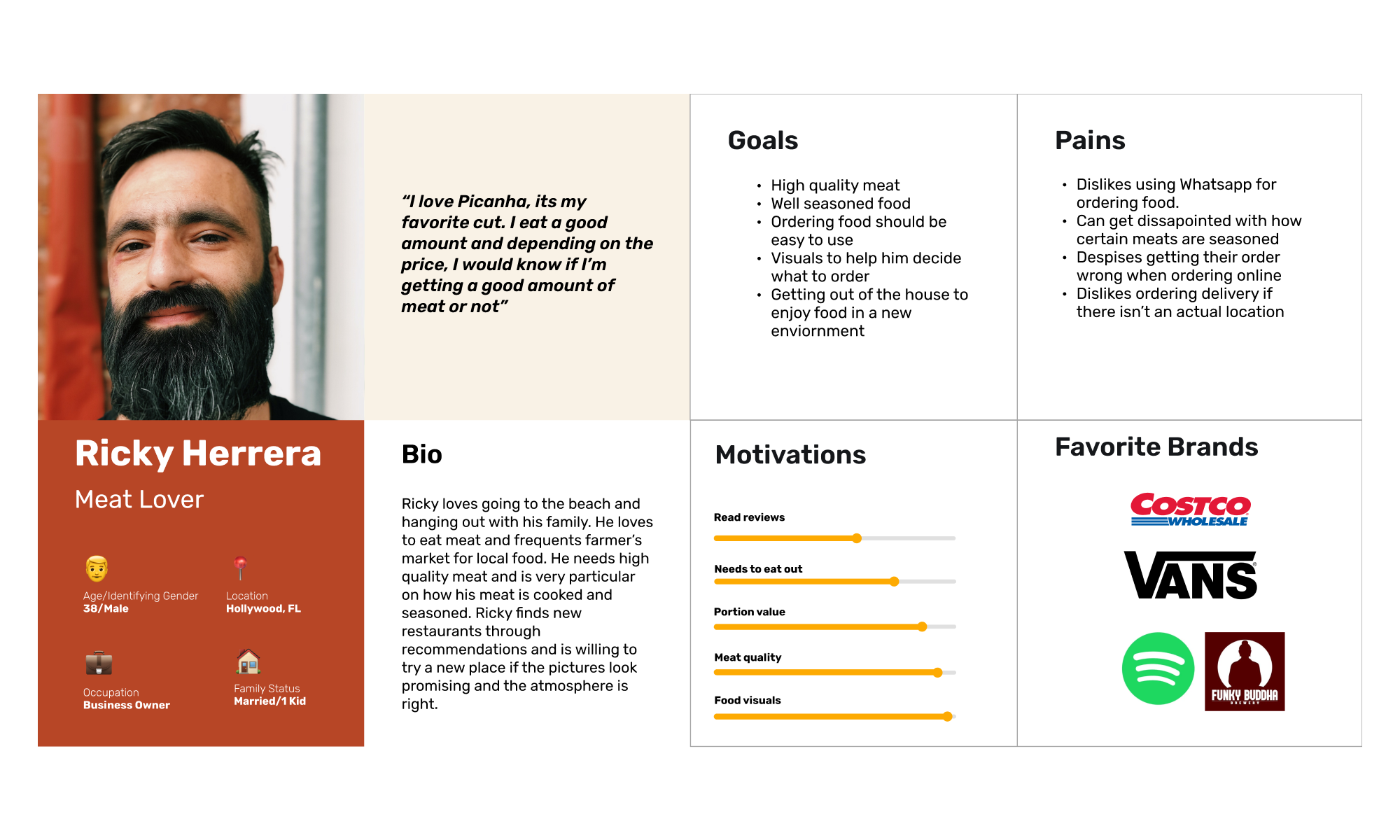
With great insight into our users’ expectations, we created a User Persona to better understand the customers of Smoked Meeting Express and find areas where we could cater to them, specifically how to prioritize the visual features of the menu and website, and how to create an intuitive checkout experience.
Define & Ideate
Mapping the User Journey
We transitioned into the Define and Ideation stage by creating a User Journey Map to understand how our user persona would behave to try and extract design opportunities from it.
We iterated on adding an Events tab where users can find Smoked Meeting Express in person. Adding a feature to check if a delivery address is within the delivery range before starting an order should help reduce confusion among users who are outside the delivery range.
Setting Expectations: Business and User Goals
After gathering insights on how to best design for the Smoked Meeting Express customer, we began iterating on the business goals and what problems our designs should focus on.
Our client's biggest problem is the lack of trust new customers have about ordering food through the alternative methods of WhatsApp and Instagram, meaning they need a more standard and secure way for new and existing customers to order.
Then, we created an MVP that would satisfy our problem statement and decided to focus on the basics of online ordering. In this case would be a menu with prices, an online ordering portal, and a secure payment experience.
We decided on the following Problem & Hypothesis Statement and MVP to continue with our designs.
Creating the Information Architecture
We created a Site Map to help us understand how users would navigate the website.
On the Home page, users can discover the founders’ story and read about their smoking method. Below that, users can see the menu and place an order, and towards the bottom, we added their Instagram feed so users can see the latest post and get inspiration for what to order.
Design
Low Fidelity Wireframes
After organizing the information architecture on our website, my teammates and I created Low Fidelity Wireframes and tested them with the same users we interviewed. Below is the feedback we received, which I’ve also noted on the sketches:
Improve the text on the delivery disclaimer and make the text more visible.
Improve the visibility of the cart to increase conversion.
Improve the footer by including more information.
Mid Fidelity Wireframes
After iterating on the Low Fidelity Wireframes and implementing the feedback we received, we created the Mid fidelity Wireframes to start designing for the functionality of the website. We focused on creating a home page highlighting the Menu and Catering Pages to increase conversion. Additionally, we designed the online ordering menu bto reduce confusion by separating each product in a box and creating categories like Popular Items to help users navigate checkout.
Testing Results
Moodboard
How do we aesthetically communicate the brand’s values? What do we want customers to feel when they browse the Smoked Meeting Express Website?
Our next step was to create a Mood Board to begin iterating on the aesthetic for the branding and website. Our clients love the fact that people enjoyed their food while getting together with friends and family, so we wanted to replicate that feeling by creating a mood board that felt fun and approachable. This mood board guided our future design choices and was a helpful starting point for the visual elements we would later incorporate.
UI Kit
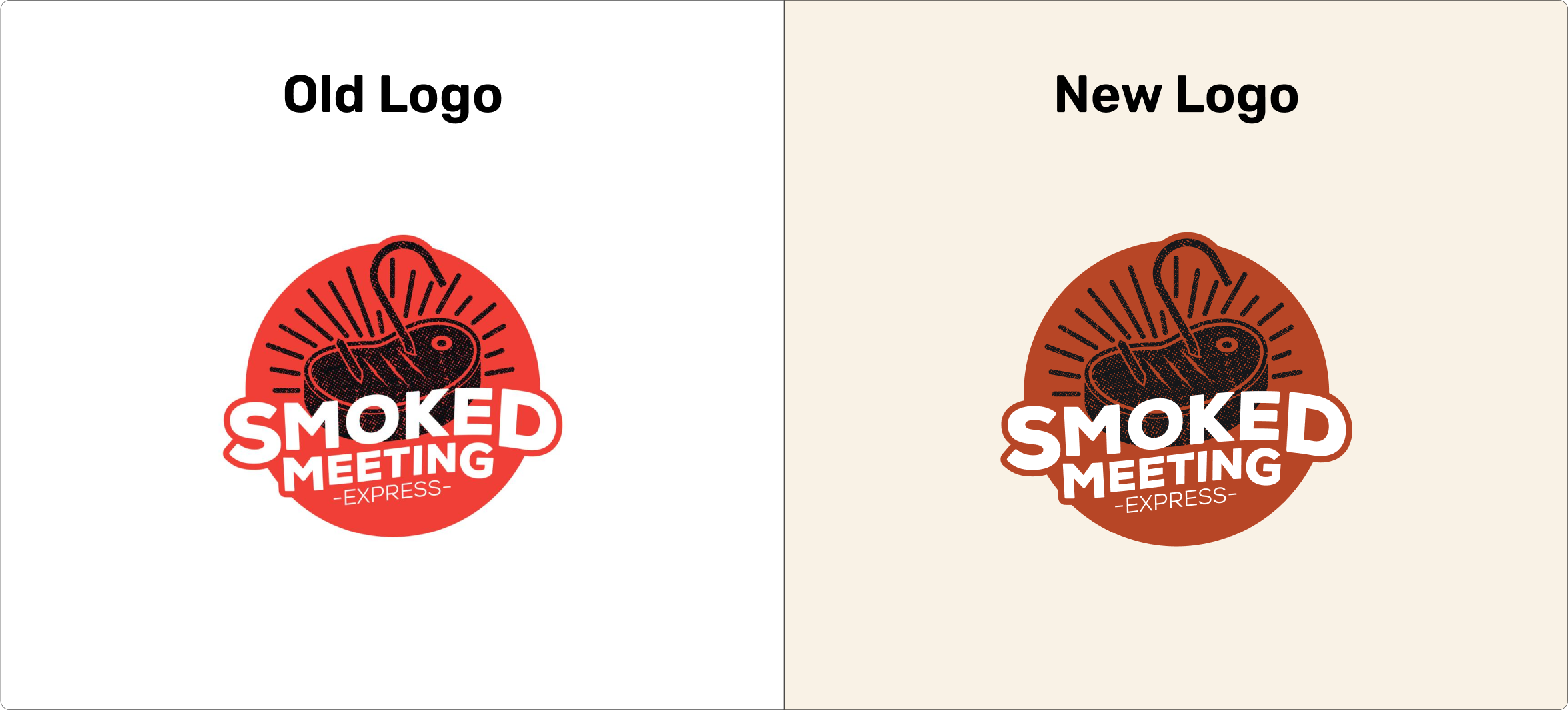
We created a UI Kit to organize the components and to show our stakeholders how we were incorporating the new branding. We iterated on the logo and darkened the original background color to fit with the new branding.
We wanted the website to reflect some of the rustic attributes that represent the cooking style of our client, so we incorporated design elements that translated that feeling (such as drawings of different cuts of meat and the type of smoker they use).
High Fidelity Wireframes
Features
How could we create a more convenient user experience?
Highly Visual Menu to Guide Users Through Ordering
Based on the data gathered from the user interviews, 100% of users shared that images were the biggest decision driver for choosing what to order at a restaurant. We wanted users to feel informed and confident when deciding what to order by incorporating images and graphics for the items available on the menu.
Check Delivery Availability Before Ordering
We created a feature for users to check if their address is available for delivery and placed it at the beggining their order to reduce confusion and increase satisfaction among new customers. If there's ever a case where a user who's outside the delivery
Prototype & Reflections
Prototype
Reflections
Learnings and Next Steps
This project taught me the importance of using data to prioritize building features that best help users interact with a product. In the case of Smoked Meeting Express, they needed a website to increase trust among new customers and retain their current customer base. It was important for our client that their website not only serves the purpose of receiving orders but also as a place for users to know where they can try their food at vendor events, giving their website more value than just using it as a point of sale.
If we had more time, I would have liked to design the Events page to show our client's past and future vendor market events to help increase brand awareness. Additionally, the Events page can be another driver for incentivizing users to sign up for emails, or to keep up with Smoked Meeting Express by following them on social media.
Thank you so much for reading. Want to discuss this in detail? Shoot me an email at joselynehernandezuxui@gmail.com


